I'm addicted to all the new public domain material being released.
Today's gem is definitely one for font fanatics - and anyone interested in the 17th century.
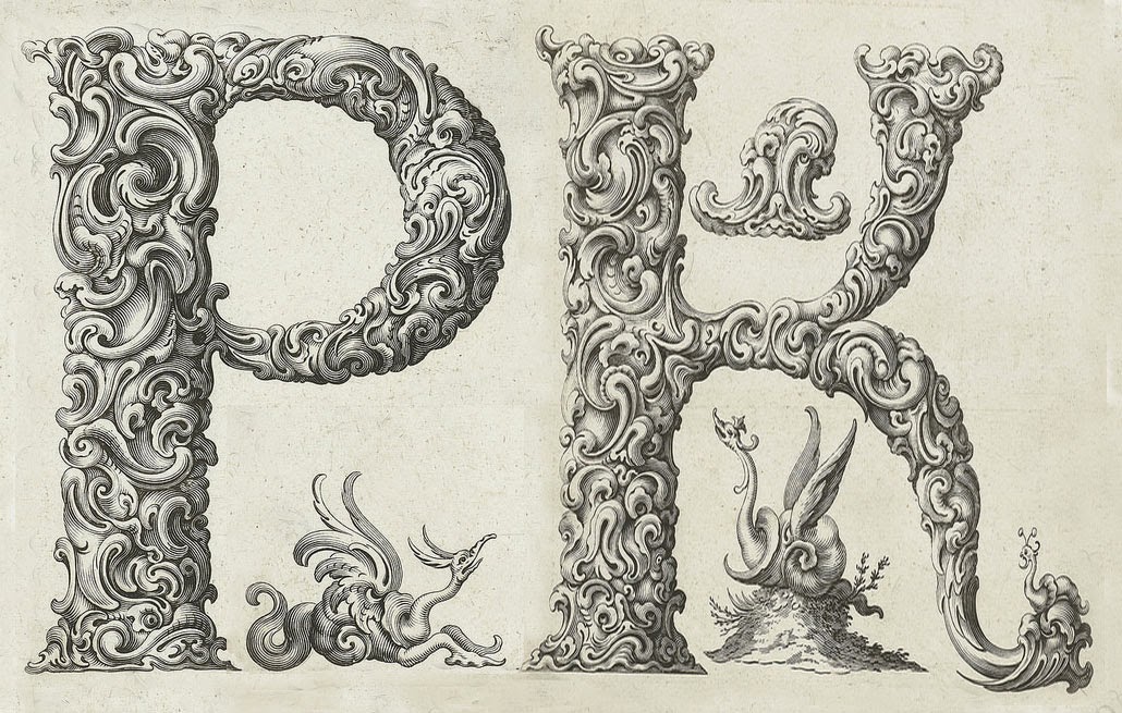
It's an Alphabet of Organic Type from around 1650. It takes the form of a series of stunning prints – titled Libellus Novus Elementorum Latinorum – designed by the Polish goldsmith Jan Christian Bierpfaff (1600-ca.1690).
It's engraved by fellow-countryman Jeremias Falck (1610–1677). According to BibliOdyssey blog, Bierpfaff worked as an apprentice at the Mackensen family of metalworkers in Cracow, a group “who introduced the Dutch auricular (‘shell or ear-like’) style of ornament into the Polish gold and silver workshops”.
You can see the influence of this auricular style in Bierpfaff’s letterforms but also the unmistakable baroque stylings of the grotesque. The result is "wonderfully surreal", the writhing forms hovering somewhere between the monstrous and floral.
Just for fun, I put together a new monogram for myself. If your name is John Underwood, or Umberto Jueves, for that matter, you're out of luck. No J or U.
I realised that the P and K both had snarky little dragons lurking in the background. Interesting. I twiddled about and turned one of them round so they're grumbling at each other ...
By Pamela Kelt

Comments
Post a Comment